
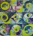
Is any fabric obviously out of place?

 06-23-2017, 10:22 AM
#12
Power Poster
Join Date: May 2008
Location: MN
Posts: 24,522
Jinny Beyer had a color theory book - Color Confidence for Quilters.
where she matched the colors "exactly" in the focus fabric and then added "bridging" colors between the exact matches - and then she only "used" the bridging colors.
Example: I have red-orange and blue-violet to match - I use red-orange, red, red-violet, violet, and blue-violet in my color sequencing - and then only use the red, red-violet, and violet
From her pictures, the effect was more interesting than using exact matches.
The book seems to be moderately priced on the used-book venues.
06-23-2017, 11:08 AM
#13
Senior Member
Join Date: Apr 2017
Location: Gilbert, AZ
Posts: 985
You could also draw up your pattern on graph paper. Cut small pieces from your fabrics and audition them that way. Did it recently and it helped tremendously. Only took very tiny pieces and the end result was perfect.
06-23-2017, 01:10 PM
#14
Super Member
Join Date: May 2013
Location: Ballwin, MO
Posts: 4,238
That is such a gorgeous floral! The fabrics you have look good to me. I would try adding some blue just to see how it looked. I do hope you will show us the end result, because it sounds like it will be beautiful.
edit
bearisgray, thanks for the book mention. I just bought a used copy.
edit
bearisgray, thanks for the book mention. I just bought a used copy.
 06-23-2017, 02:11 PM
#16
Super Member

Join Date: Sep 2011
Location: Canadian in Minnesota
Posts: 3,078
I think the pink and peach floral next to the rosebuds might be off. On my monitor it reads a little too yellow while your other pinks have a blue undertone. Your darkest fabric may be too black. Love your large floral. Cant wait for your next posting.
 06-23-2017, 07:38 PM
#18
Senior Member

Join Date: Dec 2012
Posts: 707
There is so little dark that I doubt it will be a problem for you since I see it in your focal fabric. Your colors look wonderful. The thing is that when you ask us we all have different monitors and will look a bit different to each of us. Trust your own eye. I always squint and then I can see if anything jumps out. Please be sure to post a pic. Looking forward to it!
06-24-2017, 05:32 AM
#20
Super Member
Join Date: May 2012
Location: Central Wisconsin
Posts: 4,391
What beautiful fabrics! I would take out the darkest one or two and the lightest one or two. I've see quilts in which the focus pieces were so close in color value to the background that you could hardly see them. That makes a hole in the pattern. I like Jenny's latest quilt: Snail Trail. All the snails are quite visible and beautiful.

Thread
Thread Starter
Forum
Replies
Last Post
butterflywing
General Chit-Chat (non-quilting talk)
26
09-22-2010 08:18 AM
