Bargello fabric colors - how do these look?
 09-19-2021, 04:04 PM
#1
Senior Member
Thread Starter

Join Date: Dec 2011
Location: Colorado
Posts: 580
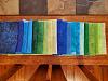
I am doing my first bargello quilt, following the pattern Surf Song from Eileen Wright's book Twist and Turn Bargello Quilts. I want to use blues and greens (I found an image of a quilt I loved, I believe the quilt was actually made by a member of Quilting Board - Eddie - a number of years ago).
It wasn't as hard as I thought it would be to choose fabrics. I did end up going to a second LQS and ended up replacing 5 fabrics. Since the pattern calls for 20 fabrics, I feel pretty good that I only felt I needed to swap out 5!
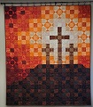
How do these fabrics look together? I took a picture in color then in black and white. I am also posting a picture of the quilt that is my inspiration for color. Nervous to start cutting!


It wasn't as hard as I thought it would be to choose fabrics. I did end up going to a second LQS and ended up replacing 5 fabrics. Since the pattern calls for 20 fabrics, I feel pretty good that I only felt I needed to swap out 5!
How do these fabrics look together? I took a picture in color then in black and white. I am also posting a picture of the quilt that is my inspiration for color. Nervous to start cutting!


 09-19-2021, 09:44 PM
#3
Super Member

Join Date: Jul 2018
Location: Southern USA
Posts: 2,050
I think it will be beautiful! I have just made Bargello runners but I love the process. I have been wanting to make this pattern also, but I have to get it first-lol-I will be anxious to see your finish.
09-20-2021, 01:19 AM
#4
Power Poster
Join Date: May 2008
Location: MN
Posts: 24,581
The first dark blue on the left sort of "stood out" to me -
Perhaps rearrange/rotate the fabrics - like what happens when one makes a bargello - to see how the fabrics play together when they are "moved"
(I know what I mean with that last sentence, but it definitely reads awkwardly. Maybe someone can help me/us out?)
Perhaps rearrange/rotate the fabrics - like what happens when one makes a bargello - to see how the fabrics play together when they are "moved"
(I know what I mean with that last sentence, but it definitely reads awkwardly. Maybe someone can help me/us out?)
09-20-2021, 06:05 AM
#7
Senior Member
Thread Starter
Join Date: Dec 2011
Location: Colorado
Posts: 580
The first dark blue on the left sort of "stood out" to me -
Perhaps rearrange/rotate the fabrics - like what happens when one makes a bargello - to see how the fabrics play together when they are "moved"
(I know what I mean with that last sentence, but it definitely reads awkwardly. Maybe someone can help me/us out?)
Perhaps rearrange/rotate the fabrics - like what happens when one makes a bargello - to see how the fabrics play together when they are "moved"
(I know what I mean with that last sentence, but it definitely reads awkwardly. Maybe someone can help me/us out?)
09-20-2021, 12:55 PM
#9
Super Member
Join Date: Jul 2013
Location: South Dakota
Posts: 8,147
I think you are going to be fine with that particular pattern, as it is waves and does not intertwine. So even though your blues look very similar, it won't "muddle" the design. When I look at your thumbnail pictures without my computer glasses on, I can only count 12 different colors changes. It can give very subtle shading and sometimes that it can be too subtle for the design.
One of my biggest mistakes when pulling fabric (and embroidery thread) is having colors that are too close together, so when you back up a bit, you end up losing some of the pattern because of it.
One of my biggest mistakes when pulling fabric (and embroidery thread) is having colors that are too close together, so when you back up a bit, you end up losing some of the pattern because of it.