
Can't figure out what's wrong with this picture!
 12-12-2012, 06:03 PM
#1
Junior Member
Thread Starter

Join Date: Oct 2012
Location: Chippewa Falls, WI
Posts: 159
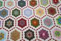
I decided to take a break from the seminole border I am working on... all the little squares were making my head spin. I fell in love with the pink and green floral and thought the arrowhead blocks would look great with it, but they don't look right and I can't figure out why. Is the white messing it up since there is none in the floral.. too much contrast, not enough contrast? Maybe I need a different block? or a block with just the pink and green? Any opinion is welcome!

 12-12-2012, 06:29 PM
#4
Super Member
Join Date: Aug 2010
Location: Piedmont Virginia in the Foothills of the Blue Ridge Mtns.
Posts: 8,562
Are these fabrics and these blocks all you have of the quilt so far? If there's more, can you post a pic?
The way these blocks are currently designed, the white is very dominant. Also the values are all mediums, little contrast is seen. Perhaps pushing the colors more to the dark, even if they are not technically "in" the floral print, and adding some very light values of the colors (very soft sweet peach, much paler green, a pale, pale blueberry/violet) might help you like the look better.
Sometimes I make a color copy of the block then color it a new way with color pencils; lay that on the quilt and see if it's better.
You have the color families of red (the coral/peach), green, and hints of blue evident. Perhaps adding a pale yellow (the 4th "primary" color) rather than white would help soften the starkness of the white.
Jan in VA
 12-12-2012, 06:32 PM
#6
Junior Member
Thread Starter
Join Date: Oct 2012
Location: Chippewa Falls, WI
Posts: 159
This is all I have so far. I started making "sample" blocks after I made an enitre quilt with fabric I "loved" and ended up not liking the quilt. Now I try things out first. Thanks .
 12-12-2012, 06:52 PM
#9
Super Member

Join Date: Oct 2007
Location: Ashdown, AR
Posts: 9,238
I love the pattern of the blocks but I agree that the white is too stark. I think I would either put the pink and green together or use the floral for sashing or you could use the floral in place of the white.

Thread
Thread Starter
Forum
Replies
Last Post
Zyngawf
QB Help Center
4
11-22-2014 07:00 PM
KellyK
Main
8
08-07-2010 12:39 PM
