Go Back  Quiltingboard Forums >
  • Main
  • Do these match or clash? >
  • Do these match or clash?

  • Do these match or clash?

    Thread Tools
     
    Old 05-31-2013, 09:13 AM
      #1  
    Junior Member
    Thread Starter
     
    SavedByGrace's Avatar
     
    Join Date: Aug 2011
    Location: Iowa
    Posts: 297
    Default Do these match or clash?

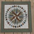
    I want to make a table running using patriotic fabrics and English paper piecing. Some fabric is more "muted"/Americana looking and some is brighter and more vibrant colors. Can I mix them or would that make the muted look dull? Not sure if this pic will show you what I'm talking about or not.
    Attached Thumbnails dsc00100.jpg  
    SavedByGrace is offline  
    Old 05-31-2013, 09:18 AM
      #2  
    Super Member
     
    charsuewilson's Avatar
     
    Join Date: Jan 2013
    Location: Virginia
    Posts: 1,203
    Default

    I think they look great together.

    I love the postage stamp fabric

    Last edited by charsuewilson; 05-31-2013 at 09:35 AM.
    charsuewilson is offline  
    Old 05-31-2013, 09:18 AM
      #3  
    Super Member
     
    Dina's Avatar
     
    Join Date: Jan 2010
    Location: Texas
    Posts: 5,500
    Default

    I am no expert, but I think they look good together.

    Dina
    Dina is offline  
    Old 05-31-2013, 09:19 AM
      #4  
    Power Poster
     
    Join Date: May 2008
    Location: MN
    Posts: 24,522
    Default

    I would keep the muted ones separate from the brighter ones -
    but that's just my preference.

    I like the three hexagons that you have together -

    I think the muted ones look washed out and 'old/used' with the brighter prints.
    bearisgray is online now  
    Old 05-31-2013, 09:20 AM
      #5  
    Power Poster
     
    Join Date: Mar 2009
    Posts: 15,639
    Default

    I think the muted ones tone down the brightness. If you like that then keep them in. If you want to keep the brightness level high then do as bear suggested, and take them out.
    MadQuilter is offline  
    Old 05-31-2013, 09:31 AM
      #6  
    Power Poster
     
    dunster's Avatar
     
    Join Date: Mar 2009
    Location: Lake Elsinore, CA
    Posts: 15,188
    Default

    My first quilt had this "problem" of bright and dull fabrics, and I didn't finish it for years because of that. When I finally finished it, I loved it! http://www.quiltingboard.com/picture...s-t174293.html
    dunster is offline  
    Old 05-31-2013, 09:46 AM
      #7  
    Super Member
     
    Join Date: Jan 2011
    Location: Ocean Springs, MS
    Posts: 9,287
    Default

    No, they look good.
    Sewfine is offline  
    Old 05-31-2013, 10:28 AM
      #8  
    Super Member
     
    Join Date: Mar 2013
    Location: Southern Indiana
    Posts: 3,111
    Default

    I think they look great! My son was born on the 4th of July I should make him a quilt like this and dunsters... awesome idea
    meyert is offline  
    Old 05-31-2013, 11:08 AM
      #9  
    Super Member
     
    eparys's Avatar
     
    Join Date: Sep 2008
    Location: New England, USA
    Posts: 2,963
    Default

    Yup - looks good to me! I would go with it!
    eparys is offline  
    Old 05-31-2013, 11:20 AM
      #10  
    Super Member
     
    Join Date: May 2011
    Location: Pacific NW
    Posts: 9,490
    Default

    I think the little bit of bright white will add sparkle to the rest of the quilt. I vote for keeping all the fabrics in.
    Peckish is offline  
    Related Topics

    Posting Rules
    You may not post new threads
    You may not post replies
    You may not post attachments
    You may not edit your posts

    BB code is On
    Smilies are On
    [IMG] code is On
    HTML code is On
    Trackbacks are Off
    Pingbacks are Off
    Refbacks are Off


    FREE Quilting Newsletter