
Fresh Lilacs Update mistake
 05-14-2017, 11:10 AM
#51
Super Member
Thread Starter
Join Date: Apr 2010
Location: Northeastern Indiana
Posts: 2,800
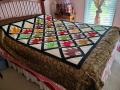
[ATTACH=CONFIG]573116[/ATTACH]Here is the corner of my mess. Do y ou see that the two inch inner border is lost? I also do not like the whiter scallap border against the beige of the inner border. Not enough contrast.

 05-14-2017, 01:17 PM
#53
Power Poster

Join Date: Jul 2010
Location: PA
Posts: 10,703
I like what you have done. That the inner border disappears is not a problem as I see it. It blends with the white and only enlarges the look of the scallop effect. I really like it. The whole quilt is beautiful.
peace
peace
05-14-2017, 09:29 PM
#54
Senior Member
Join Date: Sep 2013
Location: Saskatchewan
Posts: 838
I agree with ube quilting - I like the way you have it. In the original pictures, I liked how the narrow cream border blends with the cream of the outer border. It creates a nice visual space between the inner and outer purple. With the outer border turned the other way the cream border is more distinct, but I find it visually choppy.
05-15-2017, 06:08 AM
#55
Senior Member
Join Date: Jan 2013
Posts: 964
I like the way you currently have it as well. Rather than the narrow cream being a border accent, it carries the background from the body of the quilt beyond the purple inner border. I like how that highlights the inner purple.
Sometimes what we see up close gives a different impression than seeing the whole quilt.
Ultimately, though, it's your quilt, so it should be what looks best to you
Michelle
Sometimes what we see up close gives a different impression than seeing the whole quilt.
Ultimately, though, it's your quilt, so it should be what looks best to you
Michelle
05-15-2017, 01:30 PM
#56
Super Member
Join Date: Oct 2012
Location: Minneapolis, Minnesota
Posts: 1,000
First, let me say that your quilt is gorgeous. What I would do is take the middle beige border off and run the outer border (with the purple on the outer edge) up against the purple inner border. I don't think the middle border is necessary. In fact, I think it would be better without it. Just my humble opinion. It will be a lovely quilt whatever you do.
Last edited by loisf; 05-15-2017 at 01:32 PM.
05-16-2017, 06:59 PM
#58
Senior Member
Join Date: Mar 2010
Location: Central Pa.
Posts: 418
My post was for the ripping of your first dilemma. I see that you did Re sew the boarder. I like it the way you have it now. Beautiful, please show when done. I also enjoyed the comments about binding choices.
05-19-2017, 07:47 AM
#59
Super Member

Join Date: Sep 2007
Location: Texas
Posts: 2,665
I would just like to say it's a beautiful quilt and it's your quilt, do what your're comfortable with. Me, I think I would leave it just the way it is. But, if you are going to be unhappy with it every time you look at it, well.......
05-19-2017, 12:30 PM
#60
Super Member
Join Date: Jan 2012
Location: NE Missouri
Posts: 6,418
Whatever you decide, I vote for them to go the same way, whichever it is. I checked out the sites mentioned and I agree with the comment about the green binding. A deep purple would look much better, IMHO. Beautiful, beautiful quilt.

Thread
Thread Starter
Forum
Replies
Last Post
AngelinaMaria
Main
10
03-19-2015 03:48 PM
