
Help with bargello please
 08-22-2018, 03:11 PM
#1
Super Member
Thread Starter
Join Date: Mar 2010
Location: Upstate NY, north of Syracuse Area
Posts: 6,003
I am going to make my first bargello using a pattern I found that is very simple and basic. It uses larger strips than most. I plan to make my own design, using the quilt I saw as a guideline. All the squares are the same size in the original but I want to add more flow using some different widths when cutting the strip tube.
My problem is I am not happy with the fabric layout I have come up with. It's especially the lighter pinks and floral, I am showing two layouts but I'm not really happy with either.
Please help by making suggestions on my fabrics and layout.
Question two is this: Most bargellos I have seen use the blending of one fabric to the next and I like that. I am just wondering whether it's ok to mix the fabrics all up rather than having them from dark to light as it were?
The first photo is of all the fabrics except the very last one. The next two are of the light fabrics area that I am most unhappy with.
Looking forward to suggestions on fabric selection as well as placement. Thanks in advance for all the great help I know will be forthcoming!!
[ATTACH=CONFIG]599903[/ATTACH]
[ATTACH=CONFIG]599902[/ATTACH]
[ATTACH=CONFIG]599901[/ATTACH]

 08-22-2018, 06:04 PM
#4
Super Member
Thread Starter
Join Date: Mar 2010
Location: Upstate NY, north of Syracuse Area
Posts: 6,003
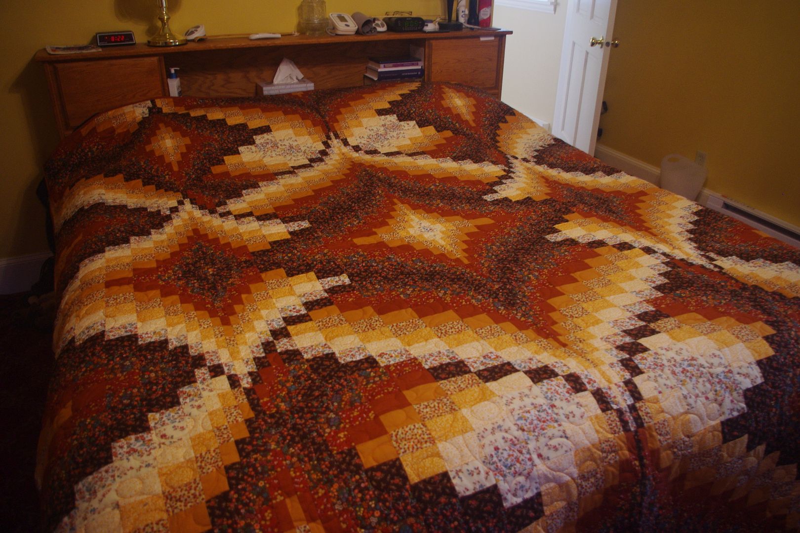
Cathy, your quilts are beautiful and I do think I am more attracted to the brown one. Guess I'll try to stick to the dark to light for now.
Wannabee, I will make those changes and post another photo, probably have to be tomorrow unless I can't sleep. LOL
Wannabee, I will make those changes and post another photo, probably have to be tomorrow unless I can't sleep. LOL
08-22-2018, 07:05 PM
#5
Super Member
Thread Starter
Join Date: Mar 2010
Location: Upstate NY, north of Syracuse Area
Posts: 6,003
Well, I had to try the changes and see it. Photos of the 2nd arrangement of the burgundies and the lighter ones. Also, a third change to the lighter pinks I kinda like a little better even.
[ATTACH=CONFIG]599918[/ATTACH] [ATTACH=CONFIG]599919[/ATTACH] [ATTACH=CONFIG]599920[/ATTACH]
[ATTACH=CONFIG]599918[/ATTACH] [ATTACH=CONFIG]599919[/ATTACH] [ATTACH=CONFIG]599920[/ATTACH]
 08-23-2018, 02:43 AM
#7
Super Member

Join Date: Sep 2011
Location: Canadian in Minnesota
Posts: 3,078
The 3 fabrics on the far right should be reversed and plopped in just before the light floral if you're doing a light to dark wave. (I'm working up the courage to make my own bargello, so I'm interested in your progress.)
08-23-2018, 03:49 AM
#8
Super Member
Join Date: Jul 2013
Location: Georgia
Posts: 8,154
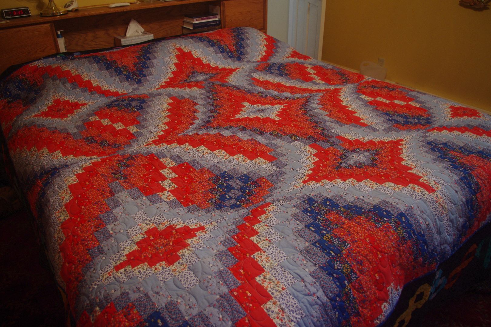
If you want the stark contrast like the brown quilt, you need to make sure you have a large difference in the fabrics you have on the edges. I've found having dark next to dark won't give you as much "Pop" as having dark next to light.
with the brown, it was laid out with the darkest brown one end, and the lightest tan on the other. with the blue/red, it ended up with a mid blue on one end, and a mid red on the other, and the contrast didn't work out like I had hoped.
the lines of most contrast in the red/blue quilt is between the darkest red and the white/red print, which was more in the middle of the pattern so it dilutes the bold look of the design.
Look over your pattern and decide where you want the boldest contrast to be, and then make sure you have your fabric laid out so it matches that. Some bargellos have a wave pattern where you don't really have that. the one I did has a bold diamond shape repeated, and it got "lost" in the red/blue quilt because of the order the colors were laid out to begin with.
08-23-2018, 09:36 AM
#10
Super Member
Thread Starter
Join Date: Mar 2010
Location: Upstate NY, north of Syracuse Area
Posts: 6,003
My one problem is that the palest "peachy" fabric was a gift from a good friend of the recipient, and she specifically asked if it could be in the quilt. I will look thru the other fabrics gifted to see if I can find one that would work better.

Thread
Thread Starter
Forum
Replies
Last Post
Girlfriend
Pictures
56
05-07-2015 07:45 AM
Dina
Main
29
05-07-2014 08:58 AM
dsb38327
Pictures
95
01-09-2011 06:13 AM
