
Help me choose!
 07-31-2019, 06:37 AM
#1
Super Member
Thread Starter
Join Date: Aug 2018
Location: Greater Peoria, IL -- just moved!
Posts: 6,141
My BFF of some 40+ years is having a lumpectomy soon and I am whipping up a comfort quilt. I have the pattern planned and drafted out. I had two color options to go with, bright or not-so-bright, after discussion my Tuesday group helped me decide on the not-so-bright florals. I have (3) sets of fat quarters I picked up at the thrift store, 2 are identical and one is different but they both go together. Have other fabrics in my stash as well.
Somewhere in my stash is a perfect piece of mossy green, but I've looked for two days and am moving on. I've ruled out the beige tone-on-tone background and I'm down to these two. Both have plenty of fabric (roughly 1 yard cuts, I need about 28 inches).
So, patterned or reads-as-solid are my current choices. Do you have a preference or should I keep looking and what should I be looking for?


") 07-31-2019, 08:38 AM
07-31-2019, 08:38 AM
#4
Super Member
Thread Starter
Join Date: Aug 2018
Location: Greater Peoria, IL -- just moved!
Posts: 6,141
Oh, Bearisgray, I like some of those quite a lot but my plain is to start cutting today while the mood and the spirit are willing. The one I was looking for is most like your D fabric, but a little brighter and maybe 3-4 similar shades of green, less overall color.
The good news is that I did find a missing project bag while I was looking, it had fallen off the back of the shelf and was in a black fabric Safeway bag so very hard to see back there...
Guess I'm going to do the flip a coin thing at noon unless I've started cutting before then, I can really go either way and have all morning on which I like better and why. Helps also that I've seen the ones I rejected, a lot of them were simply too light or too dark, and medium seems to be the better option. The fat quarter fabrics are more blue but have some green, the background fabrics in the picture look greener to me in real life.
I can always make another quilt for her later but I want to get this one to her quickly.
Last edited by Iceblossom; 07-31-2019 at 08:51 AM.
07-31-2019, 10:24 AM
#7
Super Member
Join Date: May 2017
Location: Sunny Florida
Posts: 4,429
This is a tough choice. Going with your plan of "not so bright florals" I like the bottom fabric (1st picture). I like the softer tone on tone look of the bottom fabric. The scale of the top fabric doesn't feel right against the squares. Just an opinion. I know the quilt will be beautiful and loved. Best wishes for your friend.
Can we see the fabric squares against that fabric without the competing blue (on top). Of course monitors are different.
Can we see the fabric squares against that fabric without the competing blue (on top). Of course monitors are different.
07-31-2019, 10:31 AM
#8
Super Member
Thread Starter
Join Date: Aug 2018
Location: Greater Peoria, IL -- just moved!
Posts: 6,141
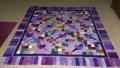
Is that what you wanted, Rhonda? The extra fabrics up top will also be used.
Because of my vision issues I usually go high contrast. But trying to stretch a bit with the "low volume" popular concept.
Because of my vision issues I usually go high contrast. But trying to stretch a bit with the "low volume" popular concept.


Thread
Thread Starter
Forum
Replies
Last Post
