
Help! Why does this look so bad?
 07-31-2017, 04:09 PM
#31
Senior Member
Join Date: Feb 2013
Location: East Kootenays, BC
Posts: 947
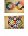
I think your second attempt is a big improvement over the first go! I agree with loisf on her take on the problem. The solids read a bit harsh, where a mottled or print would soften and play better. I feel your pain! It's a challenge I struggle with as well, but when you figure it out, you'll know!
 07-31-2017, 04:50 PM
#33
Super Member
Join Date: Aug 2010
Location: North Central, NC
Posts: 2,741
Your second version is so much better. The one thing I noticed that appears to be different from the blue one is that you have a number of what look to be plain white blocks in some of the middles whereas the blue quilt seems to have all prints.
Not sure if that is what is causing you to not like it or not.
edited: I just read the last couple of replies and see that this is what two others have noticed so maybe that is the answer.
Not sure if that is what is causing you to not like it or not.
edited: I just read the last couple of replies and see that this is what two others have noticed so maybe that is the answer.
Last edited by KLO; 07-31-2017 at 04:52 PM.
07-31-2017, 04:58 PM
#34
Super Member
Join Date: Mar 2010
Location: New Hampshire & Maine
Posts: 3,300
Second try looks so much better to me, too. One suggestion I have: you have two blocks that are the same next to each other (first row #3 and second row #4). I would move one to the bottom of the quilt. Just my two cents....
Finish it up and if you still just don't like it, donate it to a charity. I would keep going with it!
Finish it up and if you still just don't like it, donate it to a charity. I would keep going with it!
07-31-2017, 05:03 PM
#35
Super Member
Join Date: Mar 2016
Posts: 2,853
For everyone's future references, there appeared to be about 8 fabrics in the blue quilt top. There were 14 fabrics in the last revision of the green quilt. What I learned from that, is that too many fabrics don't work that well unless you're doing a scrappy quilt or they blend really well.
I agree. Finish it and donate it. Try it again with your newfound knowledge.
bkay
I agree. Finish it and donate it. Try it again with your newfound knowledge.
bkay

 07-31-2017, 11:55 PM
#38
Super Member
Join Date: Jan 2012
Posts: 4,783
One difference I see between the blue quilt and your second layout is the blue quilt has many more of the light blue fabrics in it and many more of the darkest blue fabrics in it. Try adding more of your soft light green fabrics and your darkest green fabrics.
 08-01-2017, 03:26 AM
#40
Power Poster
Join Date: May 2008
Location: MN
Posts: 24,521
How much more of each of the fabrics do you have available?
On the first picture - The first thing that caught my eye was that the lime greens seemed "clumped" together on the right hand side and I wanted to disperse them more evenly over the whole piece.
It does seem like you have two "sets" of colors going here - both could be called "green" - but one group seems to be a muted bluish green, and the yellow greens seem a lot brighter.
You could cut apart the photo you have into individual squares and try playing with different layouts. It might be easier to do on a table than on the design wall.

Thread
Thread Starter
Forum
Replies
Last Post
