
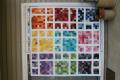
I'm beginning to think this is too busy..and how would you quilt it?
 11-03-2014, 05:05 PM
#11
Super Member
Join Date: Feb 2014
Location: Wis
Posts: 5,928
I think it's great for a pink loving person. The white border sounds like a good idea. I'd do simple quilting, like a meander, for the pink and something different, like feathers or something circley, in the white border.
 11-03-2014, 07:11 PM
#12
Super Member
Join Date: Aug 2010
Location: Piedmont Virginia in the Foothills of the Blue Ridge Mtns.
Posts: 8,562
The problem you're having is that there isn't enough contrast between the colors in the background and the pinwheel section. You would have been better off using the darkest pink in the print, it would have seemed less 'busy' to you, I believe. Then if you also used some white within the body of the quilt and made this print a larger border, it could change the whole appearance of the top. 
Jan in VA
Jan in VA
11-04-2014, 03:38 AM
#13
Senior Member
Join Date: Jun 2010
Location: So Cal
Posts: 576
Maybe you could just stitch in the ditch to outline the stars. That way the quilting wouldn't add more busyness and it might make the stars stand out more. I love the fabrics you used. I've been wanting to try that pattern.
11-04-2014, 04:31 AM
#14
Senior Member

Join Date: Jul 2013
Location: Dallas, TX
Posts: 677
It is a pretty quilt. To emphasize the stars I would take white thread and a decorative stitch on my sewing machine maybe something that is lacy looking and stitch around the stars to make them pop more. This could be done as part of the quilting.
11-04-2014, 04:44 AM
#16
Power Poster
Join Date: May 2009
Location: NY
Posts: 10,590
Your fabrics are really pretty but not enough contrast for a Hunter's Star. I am not seeing the star effect at all but I am seeing the arrowheads. Not sure there is any quilting that will get the stars to pop out unless maybe a 1/4" echo in a dark gray thread and I don't know if that would work either.
11-04-2014, 04:48 AM
#17
Super Member
Join Date: Aug 2009
Location: Illinois
Posts: 1,817
Like it as a single block but, as others have commented, the design seems to get lost when put with more blocks. It's a lot of work to not be fully appreciated! How about making a pillow from a single block?
11-04-2014, 05:00 AM
#18
Senior Member
Join Date: Feb 2010
Location: Ashtabula County, Ohio NE Corner
Posts: 377
I agree - larger Quilting maybe even on Diagonal ? or following the Shapes ? I don't care for Stipple... but sure is Pretty.... are you Hand Quilting or machine...? Maybe even applique a round circle in the center of the blocks to break up the pink and add solid pink and white border...
Last edited by Jean in Ohio13452; 11-04-2014 at 05:02 AM.
11-04-2014, 05:31 AM
#19
Super Member
Join Date: Dec 2010
Location: Portage, Michigan
Posts: 7,688
I love your colors and fabrics but I would suggest a third color to create some contrast and to make the inner stars POP!. They are lost in the two color/prints. Perhaps a solid that is lighter or darker. Maybe the darker rosey pink of the dots or that is in the paisley print. Even white or off white would bring some contrast and all the eye to see the stars. I hope this helps and is not too discouraging.
11-04-2014, 05:38 AM
#20
Senior Member

Join Date: Mar 2011
Location: Wauconda, IL
Posts: 972
You're right, it is a little busy for me, it is beautiful, though. I too would add white sashings to the quilt - it will tone the business down and add some "pop" to the quilt. I usually just do simple quilting.

Thread
Thread Starter
Forum
Replies
Last Post
Selena
General Chit-Chat (non-quilting talk)
82
07-31-2011 02:10 PM
