
Modern quilt...second guessing it...
 05-19-2018, 01:17 PM
#21
Super Member
Join Date: Apr 2018
Location: Philomath, Oregon
Posts: 2,076


 05-19-2018, 07:04 PM
#25
Super Member
Join Date: Dec 2017
Location: Southwest Idaho
Posts: 6,000
I really like this block and looks good to me. Maybe try putting the blocks on point? The corner pieces may give you what your missing in terms of appeal instead of a border, per se. It would change the look of star but it's worth playing with it at this stage.
05-19-2018, 08:06 PM
#26
Super Member
Join Date: Aug 2013
Posts: 9,299
I like it a lot, and I think it only needs a bit more yellow, light tan, copper, and sage green. Perhaps what you have "missing" is the repetition of certain colors. Since you just have one bright (the yellow), it is somewhat unbalanced as is. I love the yellow, by the way. I think the quilt needs it.
The size now is barely bigger than crib. I think for cuddling under at Christmas, it should be a foot longer and and a foot wider than the wingspan of the biggest person in the house.
I also wonder how sashing might affect the look.
If it were me, I'd probably do a scrappy binding, deep red, or chocolate brown. No border.
05-19-2018, 10:28 PM
#27
Super Member

Join Date: Dec 2010
Location: SoCal
Posts: 1,859
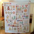
Thank you for all of the feedback. She wants a modern quilt, and I guess I will add more blocks and hope for the best! I can�t ask her if she likes it, because she will say yes, even if she doesn�t! 
The pattern is Aurora Borealis, by Susie Ledadom. So sorry that I forgot to put that in the original post.
When I only had dark blocks made, it really looked gloomy to me, so I added a few lighter blocks. The one yellow/ gold at the top is not the same fabric line, and it may be replaced. But it does brighten it up a bit! The blocks with 3 diff fabrics are my faves, but I don�t think this line of fabric has enough contrast....I may try again when I make more blocks.
Thanks again....always good to get unbiased feedback!
05-20-2018, 02:27 AM
#28
Super Member
Join Date: Aug 2010
Posts: 2,255
Whether modern or not (and I am tired of labeling), this is a very nice quilt. If you want to stop here, I'd pick a brighter color for a thin border and then a duller one for a slightly wider border. Then they'd have a nice-sized throw.
05-20-2018, 03:16 AM
#29
Senior Member

Join Date: Mar 2014
Location: Ont. Canada
Posts: 468
Modern quilts seldom have borders... so best keep to what was requested, and she'll love it.
I think this will be a stellar quilt when it is all quilted...hopefully in a manner that accentuates those stars ( not an " all over" design.
I think this will be a stellar quilt when it is all quilted...hopefully in a manner that accentuates those stars ( not an " all over" design.

Thread
Thread Starter
Forum
Replies
Last Post
