
Need Help--Not "Feeling It" Picture Heavy


 12-20-2013, 05:46 PM
#32
Super Member
Join Date: Mar 2010
Location: New Hampshire & Maine
Posts: 3,300
12-20-2013, 06:41 PM
#33
Senior Member

Join Date: Apr 2012
Posts: 764
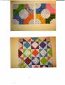
another vote for just using the order panel. the way it is designed frames the quilt gorgeously.
i would of course audition the darker green solid though...because multiple mats around a picture always look pretty good to me
aileen
i would of course audition the darker green solid though...because multiple mats around a picture always look pretty good to me
aileen
12-20-2013, 10:18 PM
#35
Super Member

Join Date: Dec 2010
Location: Monmouth, Oregon
Posts: 5,884
I agree, I think it needs a dark almost solid strip to separate the border from the blocks!! Your blocks are gorgeous!!!!
12-20-2013, 10:25 PM
#36
Super Member
Join Date: May 2010
Location: washington
Posts: 1,424
I agree with you. that one looks very rich to me. oops. didn't go where it should. the one on the left second down is the one I like best.
Last edited by karate lady; 12-20-2013 at 10:26 PM. Reason: mistake
12-21-2013, 12:27 AM
#38
Super Member

Join Date: May 2012
Location: The Granite City, Scotland
Posts: 1,635
Your quilt is lovely! I agree on the printed border fabric without any light inner strip. If you decide to add a narrow inner border, then I'd suggest something quite dark as I feel it frames such a 'majestic' quilt better than a pale colour.


Thread
Thread Starter
Forum
Replies
Last Post
bearisgray
General Chit-Chat (non-quilting talk)
65
02-01-2024 09:04 AM
Maride
General Chit-Chat (non-quilting talk)
63
12-01-2010 04:52 PM
MissTreated
General Chit-Chat (non-quilting talk)
53
11-02-2010 06:41 AM
