Go Back  Quiltingboard Forums >
  • Main
  • which one looks the best? >
  • which one looks the best?

  • which one looks the best?

    Thread Tools
     
    Old 09-04-2017, 08:38 AM
      #1  
    Super Member
    Thread Starter
     
    quiltlady1941's Avatar
     
    Join Date: Jun 2010
    Location: Illinios
    Posts: 1,260
    Default which one looks the best?

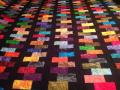
    I was asked to make the quilt falling charms, in a blue color.. But as I have never made this quilt before decided to try making it with some pink scraps I had. This is just laid out on my bed to see how it would look,

    Which do you think looks better, the one with some bright pink squares here and there or all light color pink squares?

    Thank you
    Attached Thumbnails img_1855.jpg   img_1854.jpg  
    quiltlady1941 is offline  
    Old 09-04-2017, 08:40 AM
      #2  
    Super Member
     
    Join Date: Mar 2010
    Location: Ridgefield WA
    Posts: 7,765
    Default

    I like the "pop" of the bright pink bits! Nice use of fabrics.
    Hey, I'm a 1941 also!
    Kitsie is offline  
    Old 09-04-2017, 10:54 AM
      #3  
    Power Poster
     
    dunster's Avatar
     
    Join Date: Mar 2009
    Location: Lake Elsinore, CA
    Posts: 15,188
    Default

    I also like the brights mixed in. Will be very pretty.
    dunster is offline  
    Old 09-04-2017, 12:14 PM
      #4  
    Senior Member
     
    Join Date: May 2014
    Location: North east
    Posts: 360
    Default

    Stand away from it and squint your eyes. Then decide. I personally prefer without the bright pink.
    Quilt30 is offline  
    Old 09-04-2017, 12:17 PM
      #5  
    Super Member
     
    Join Date: Nov 2011
    Location: Tn
    Posts: 8,891
    Default

    I like with the brights in it.
    cjsews is offline  
    Old 09-04-2017, 12:18 PM
      #6  
    Super Member
     
    Join Date: Mar 2016
    Posts: 2,853
    Default

    I prefer it without the bright pink. To my eye, it seems as if there is not enough bright pink to balance it. There are too few, so it jumps out at you.

    bkay
    bkay is offline  
    Old 09-04-2017, 01:04 PM
      #7  
    Power Poster
     
    QuiltnNan's Avatar
     
    Join Date: Mar 2011
    Location: western NY formerly MN, FL, NC, SC
    Posts: 51,430
    Default

    they both look good, but i like the pops of bright pink
    QuiltnNan is offline  
    Old 09-04-2017, 01:12 PM
      #8  
    Super Member
     
    Join Date: Jul 2010
    Location: Flagstaff, Arizona
    Posts: 9,475
    Default

    My vote would be the one with the bright pinks on it (the first one). I think it looks brighter and more pleasing.
    Jordan is offline  
    Old 09-04-2017, 01:47 PM
      #9  
    Super Member
     
    Join Date: Sep 2011
    Location: West Texas
    Posts: 2,073
    Default

    I like the one with the bright pinks also, but think it could use a few more scattered about if you have any.
    Daylesewblessed is offline  
    Old 09-04-2017, 02:08 PM
      #10  
    Power Poster
     
    nativetexan's Avatar
     
    Join Date: Feb 2009
    Location: home again, after 27 yrs!
    Posts: 19,388
    Default

    I like the first one better. great quilt.
    nativetexan is offline  
    Related Topics
    Thread
    Thread Starter
    Forum
    Replies
    Last Post
    patti p
    Main
    46
    03-19-2016 03:19 PM
    Teddybear Lady
    Pictures
    220
    10-23-2011 04:45 PM
    Dayken
    Pictures
    220
    10-13-2011 02:09 PM
    moreland
    Pictures
    158
    02-14-2011 09:33 PM
    Hockeyrabbit
    Main
    8
    07-14-2010 11:13 AM

    Posting Rules
    You may not post new threads
    You may not post replies
    You may not post attachments
    You may not edit your posts

    BB code is On
    Smilies are On
    [IMG] code is On
    HTML code is On
    Trackbacks are Off
    Pingbacks are Off
    Refbacks are Off


    FREE Quilting Newsletter