
Saving my ugly fabric
 09-25-2016, 03:53 AM
#11
Super Member
Join Date: Mar 2010
Location: New Hampshire
Posts: 4,555
I spent some time searching through my pictures and found the top I made with purples, greens, beiges, and an "ivory with a greenish tint". This is what I meant by a pattern with contrasting triangles.
 09-25-2016, 04:23 AM
#12
Super Member

Join Date: Jun 2011
Location: *where the sun almost always shines*
Posts: 9,325
If you decide to dye it, I think I would test a small piece first and make sure of the affect. Or, you can put it up for re-sale here on the quilt board. It sounds like a lot of people could use it. And then, you could re-buy something that works better for you.
09-25-2016, 04:56 AM
#13
Super Member
Join Date: Aug 2013
Posts: 9,299
I don't understand using an "ugly" fabric (what you personally intensely dislike) for a backing. It's half the quilt. And it's not like a backing "hides". Sure, it doesn't take center stage, but it is an integral part of your quilt. The saying "don't decorate around a disaster" comes to mind.
But if you really DO want to salvage it, you might try a couple fat quarters from the same line that appeal to you.
Or cut it up into large practice pieces to practice your FMQ.
Or resell it here. You'd take a loss, but someone else might consider it a perfect gain to their stash.
I've never found a fabric "grow on me" if I hated it from the get-go. Color is something we have an emotional response to, and it's hard to explain. Sometimes we just have to face disappointment and sing a little tune..."let it go, let it go". Haha.
 09-25-2016, 07:40 AM
#15
Super Member
Join Date: May 2013
Location: Ballwin, MO
Posts: 4,238
Since you did love it, I would let the idea of sunbeams through a forest percolate, and save the fabric until you have an inspiration. In the meantime, take a very close look at that entire collection, to get a better understanding of what will go well with this fabric.
 09-25-2016, 09:32 AM
#18
Senior Member

Join Date: Jan 2011
Location: Boston
Posts: 373
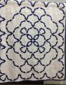
It reminds me of limestone and tilework. Have you ever seen the book "Bella Bella Sampler Quilts" which are inspired by Italian stone and tile floors? I'd do an image search for that and look for a palette inspiration.
09-25-2016, 09:32 AM
#19
Junior Member
Join Date: Oct 2015
Location: Escondido, CA
Posts: 112
Our church group received a donation from Robert Kaufman, and in it was an enormous amount of the Van Gogh material. Some really large pieces, we used them for borders and backing and binding. Take a look at this:http://www.craftsy.com/supplies/kit/...quilt-kit/2536
Also Van Gogh had cataracts that is why all his colors are yellow/green.(Tip from my DFL who was a painter)
Also Van Gogh had cataracts that is why all his colors are yellow/green.(Tip from my DFL who was a painter)


Thread
Thread Starter
Forum
Replies
Last Post
