
Should I change colors

 10-16-2013, 02:55 AM
#13
Junior Member
Join Date: Jun 2013
Location: Upstate NY
Posts: 227
10-16-2013, 03:28 AM
#14
Senior Member
Join Date: Oct 2012
Posts: 818
That's really amazing! One question: is it possible to generate the design without the black lines? They are really contributing to the stained glass look, but it's hard to imagine it without them. At least, for me. Also, the white sparkle stars are contributing a lot. Would it help to be able to see what it would be like with another fabric?
Hugs,
Charlotte
Hugs,
Charlotte
10-16-2013, 06:35 PM
#16
Super Member

Join Date: Dec 2010
Location: Twin Cities, Minnesota
Posts: 1,925
You have a great design and I love the colors. I think with a little experimenting you'll find answers to your questions. In addition to the many great suggestions already posted, try these too:
1. Vary the color placement in each pane - so each pane is unique.
2. Try using the yellow in the smallest pieces in the panes. Yellow is light and bright and by using it in smaller amounts, it won't stand out as much, yet will add sparkle. Example: top left pane.
3. Try a darker or more subtle color for the cornerstones so attention is directed to the panes.
6. My first thought about binding was the purple. I usually take a darker color from the center and use it for the binding. However, I really like the ideas previously posted about using the yellow in a small border or as a binding. I would wait until the center has been completed, then audition borders and binding. Sometimes the quilt asks for something other that what we had originally planned.
Have fun with the design phase and try lots of alternatives. Please post your final design as well as your quilt.
10-16-2013, 08:32 PM
#17
Super Member

Join Date: Aug 2010
Location: S. W. Indiana
Posts: 7,484
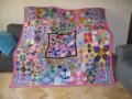
I've been playing around with a pattern for some paper piecing I think I have the design but I'm not sure of the fabric collection. This is using artisan Batiks Geoscapes E by Lunn Studios.
[ATTACH=CONFIG]441543[/ATTACH]
I would like input please, I am my own worst critic. Right now the size is 90 by 108 should I remove one of the sets of panes and add a border? Is it the wrong fabric? It seems like there is something missing but I can't figure it out. Please ingnore the black lines they are the seam lines.
I appreciate any input. This is a great board.
Would a dark charcoal or almost black work for you? Make it look more like stained glass------------if you like that.
10-17-2013, 04:31 AM
#20
Super Member
Join Date: Apr 2011
Location: Vermont
Posts: 1,095
Are the top and bottom borders intentionally smaller? My eye says something is off with the border - maybe because the size changes. Could you make them the same size AND miter the corners? With the directional fabric a miter would be my recommendation, but then again it would take away from the linear design of the quilt. So maybe what I'm recommending is a different border.

Thread
Thread Starter
Forum
Replies
Last Post
Favorite Fabrics
General Chit-Chat (non-quilting talk)
44
10-10-2013 07:46 AM
craftybear
General Chit-Chat (non-quilting talk)
10
09-23-2011 06:04 AM
