
Wracking my brain to arrange this fabric/pattern
 02-22-2013, 01:36 PM
#1
Senior Member
Thread Starter
Join Date: Dec 2012
Posts: 538
I've been going round & round with this all day...
Here's the pattern: (8 total fabrics used)
http://www.windhamfabrics.com/images..._lone_star.pdf
And the fabric I want to use is from Indigo Crossings Line [ATTACH=CONFIG]397079[/ATTACH]
For the life of me, I can't seem to get the arrangement right and not have two of the same hue in the same spot, or looking wonky. I printed in grayscale to get a sense of what colors to use where, but even if I use just "light, med, dark" I don't seem to have enough actual different colors in the Indigo line (3 shades of blue, cream and tan) to get it right. The only fabric I really am NOT fond of in the line is the stars.
Anyone want to help me tackle this?
Thanks!
Last edited by QuiltnNan; 02-22-2013 at 02:42 PM.
 02-22-2013, 01:46 PM
#2
Super Member

Join Date: Mar 2009
Location: FL
Posts: 7,084
Sometimes it helps to look at other pictures of the style of quilt you want. The only thing I've noticed in my browsing is that sometimes if the very center is too light or too dark it can look like a hole. I tend to like the ones with mid-tones in the center best. Here are some pics from Google:
https://www.google.com/search?q=lone...Lon49gS87YCABA
https://www.google.com/search?q=lone...Lon49gS87YCABA
02-22-2013, 01:48 PM
#3
Super Member

Join Date: May 2010
Posts: 1,658
I would take my cue from the picture if that is the look you are going for. If the color is neutral. pick a neutral. dark/solid looking/not busy , pick one of those. Don't be afraid to add one of your own in there if you cannot find one from this group. If it was mine, I would want a less busy fabric for the background, but that is JMHO. I think the star would stand out more. How about finding a floral that has a bit of another color in it to tie them together:red or green?
Also looks like they have repeated fabrics...Center fab matches row 5 (right after the cream), and so on. If you did that, you would not have to pick out so many! let us know how it goes...
Also looks like they have repeated fabrics...Center fab matches row 5 (right after the cream), and so on. If you did that, you would not have to pick out so many! let us know how it goes...
02-22-2013, 01:49 PM
#4
Super Member
Join Date: Oct 2011
Location: dallas tx.
Posts: 5,172
If you squint your eyes you have more darks in upper left. It seems to me if you moved one of the darks down into bottom right. and a darker tan or two into bottom left and then eyeball it.ha. I think the really darks are together. You consider the blues as medium and all tans and lights as lights. I only see 4 really darks. All blues consider medium and all other as lights. Now I'm confused! LOL Barny
Last edited by barny; 02-22-2013 at 01:52 PM.
02-22-2013, 01:52 PM
#5
Senior Member
Thread Starter
Join Date: Dec 2012
Posts: 538
Exactly, Katie- The "hole" thing. I like that this one uses a mid-tone fabric in the center rather than a sharp light or dark contrast in the center & on the endpoints. It just "flows" really well (IMO). Yup, glazing over all the L-Star quilts online, too. (There's one out there called a Grand Lone Star...love that one). I may have to modify it somehow similar to the coloring in that one, which only uses 7 fabrics. Just didn't want to have to think about 'modifying it' at this stage of the game.
02-22-2013, 03:20 PM
#6
Super Member

Join Date: Jan 2009
Posts: 4,688
I have a question. How can that quilt, as pictured, possibly be a 60" x 80" quilt as the pattern claims??? It's a square, not a rectangle...finished and bound as a square with no instructions for adding anything extra to make it into a rectangle. Doesn't anyone else find that a bit odd?
02-22-2013, 04:35 PM
#7
Super Member

Join Date: Jul 2010
Posts: 1,877
I have made a few of these Lone Stars using Quilt Smart. You will have perfect results if you use it too. The first LS I made in the traditional way got so out of shape that I tossed it! Lone Star quilts are square not rectangle.
quiltsmart.com
quiltsmart.com
 02-22-2013, 06:26 PM
#9
Super Member

Join Date: Jan 2011
Location: Knot Merrill, Southern Indiana
Posts: 5,781
LyndaOh ... I like your solution. I was going to suggest to OP that with Lone Stars it easier to use a darker color in the center to hide any ... ummmm ... mis-matches 
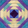
The only other thing I would add is that I love lone stars that use the same background fabric as was used in the 2nd or 3rd position down from the point of the star ... it makes the tips of the star 'float'. I've done two like this (actually 1 1/2 as I'm not finished with the second one yet) and I love the effect I get from the "floating" points.
Pic below is one that is finished to show you what I mean by the "floating" point. In mine below my background fabric is the same as the fabric used in the 4th position from the tip ... I prefer it to be the 3rd position though (which I did on the one I am making now). Also note that I didn't use the darkest fabric for the center ... and my mismatched points in the middle are a little obvious.


Thread
Thread Starter
Forum
Replies
Last Post
dreamer2009
General Chit-Chat (non-quilting talk)
82
08-05-2011 04:56 AM
AtHomeSewing
General Chit-Chat (non-quilting talk)
59
05-15-2009 08:10 PM
