
border options and I don't think I like any of them

 05-19-2010, 02:51 PM
#43
Super Member
Thread Starter

Join Date: Jul 2009
Location: Southwest Kansas
Posts: 4,820
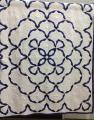
<sigh> After leaving them lay on the floor and walking past several times I've decided to look for something else. None of what I have is just right.
Maybe I'll get lucky and find that purple wave fabric in just the exact right shade of blue/green.
Maybe I'll get lucky and find that purple wave fabric in just the exact right shade of blue/green.
05-19-2010, 02:52 PM
#44
Power Poster
Join Date: May 2008
Location: MN
Posts: 24,511
Originally Posted by jljack
I think you need to look for something else. The very formal look of the teal border print fights with the informal shell motif.
and the grayish "ocean waves" fabric looks dirty compared to the rest of the item.
I like the proportions best on the third picture at the beginning of the post.
05-19-2010, 04:36 PM
#45
Super Member
Join Date: Mar 2010
Location: New Hampshire
Posts: 4,555
Originally Posted by jljack
I think you need to look for something else. The very formal look of the teal border print fights with the informal shell motif.
05-19-2010, 05:15 PM
#48
Super Member

Join Date: Mar 2010
Location: Lake Wales, FL, USA
Posts: 1,554
I like the first & second ones. I don't care for the strip of orange on the outside of the last one. If it was gone, I might like the third one, also.
I can't see enough difference in the blue shades to matter and it's far enough away from the center blue that it won't matter if it's a little off.
I can't see enough difference in the blue shades to matter and it's far enough away from the center blue that it won't matter if it's a little off.
05-20-2010, 02:48 AM
#50
Super Member

Join Date: Feb 2010
Location: New Hampshire
Posts: 3,877
I personally like the teal color with the quilt. I think it enhances your center square. I just think the pattern fights with your shell border. Maybe something in the teal color, but in a smaller print/solid/tone-on-tone?

Thread
Thread Starter
Forum
Replies
Last Post
babyfireo4
Pictures
14
10-13-2011 04:44 PM
