
Need advice on borders


 09-29-2011, 05:15 AM
#75
Senior Member
Join Date: Feb 2011
Location: Rancho Cordova, CA
Posts: 451
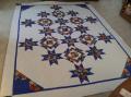
Beautiful quilt! I think the yellow sets it off, as the complementary color to purple, but either narrower (piping, faux piping, flange, peeper) or just a shade lighter. It comes across on my monitor as so bright it overwhelms the whole, but the same hue in a tad lighter shade would be more mellow while still giving a hit of zing. Shifting to the light lavender instead of the white would also be a good option.
 09-29-2011, 06:04 AM
#79
Member
Join Date: Jul 2011
Location: Northern MA
Posts: 86
My vote is for #2. Since there is no yellow in the quilt, warrant
it brightens the quilt, it still looks out of place. The violet is softer against the dark fabrics and makes more of a contrast between the quilt and outer border.
it brightens the quilt, it still looks out of place. The violet is softer against the dark fabrics and makes more of a contrast between the quilt and outer border.

Thread
Thread Starter
Forum
Replies
Last Post
buckyfan19
Pictures
130
02-07-2011 09:26 PM
