
Need your Opinion

 01-13-2011, 07:46 PM
#52
Super Member
Join Date: Aug 2010
Location: Silver Springs, NV
Posts: 2,404
I agree with others, many appear to be of same value. Not that I know a lot. just from what others have posted. have fun and be sure to post after it's made. Maybe give some tutorials while its in the makings :)
01-13-2011, 07:52 PM
#53
Super Member

Join Date: Oct 2010
Location: desert area of California
Posts: 2,206
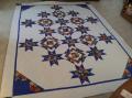
would not use a bright white, more of an off white softer in tone. My thinking is that the bright white will draw your eye to it's self and take away from the pattern. Your colors are beautiful. Depending on the pattern you have perhaps a black instead of the white would puncuate the design.
01-15-2011, 08:28 PM
#54
Super Member

Join Date: Jun 2008
Location: San Antonio, Texas
Posts: 1,828
Originally Posted by RST
That's a whole lot of medium going on there. I would add some much darker blues, and some more almost whites.
One trick that might help you evaluate -- turn your photos into grayscale (black and white) and you will be better able to tell if you have enough contrast happening.
RST
One trick that might help you evaluate -- turn your photos into grayscale (black and white) and you will be better able to tell if you have enough contrast happening.
RST

Thread
Thread Starter
Forum
Replies
Last Post
robbijmorris
Pictures
16
05-14-2009 05:35 AM
