
Another plea for help...which sashing??

 06-10-2020, 05:22 PM
#23
Super Member
Join Date: Sep 2019
Location: North Idaho
Posts: 1,704
I think you have pretty consistent answers here. I would like to see a variety of colors for the cornerstones, it will coordinate with your scrappy blocks. I think having too much consistency within your sashing is going to somehow visually conflict with the blocks. shoot, I think it would look good with scrappy inconsistent sashing too. but that's just me. love your blocks by the way!
 06-11-2020, 02:44 AM
#26
Super Member
Join Date: Dec 2010
Location: Portage, Michigan
Posts: 7,876
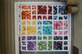
Like the blue best. When I was just looking at the thumbnail photos, my eye went to the blue grid. I MHO they allow each block to shine in its own little frame rather than blend in with the tan frame. But... in the end, it is your quilt.
06-11-2020, 02:55 AM
#27
Super Member
Join Date: Aug 2009
Location: Illinois
Posts: 1,825
Hmmmm -
On my monitor - the blue looks "heavy" - and that's what I see first. Especially on the thumbnail pictures (which I don't like - but better than no pictures at all) , the blue looks like heavy grid lines with pale patterned centers.
while the tan is sort of "just there" - I think the blocks looked more vibrant with the tan sashing. I prefer the tan sashing.


